Menu
Follow Me
Contact Me
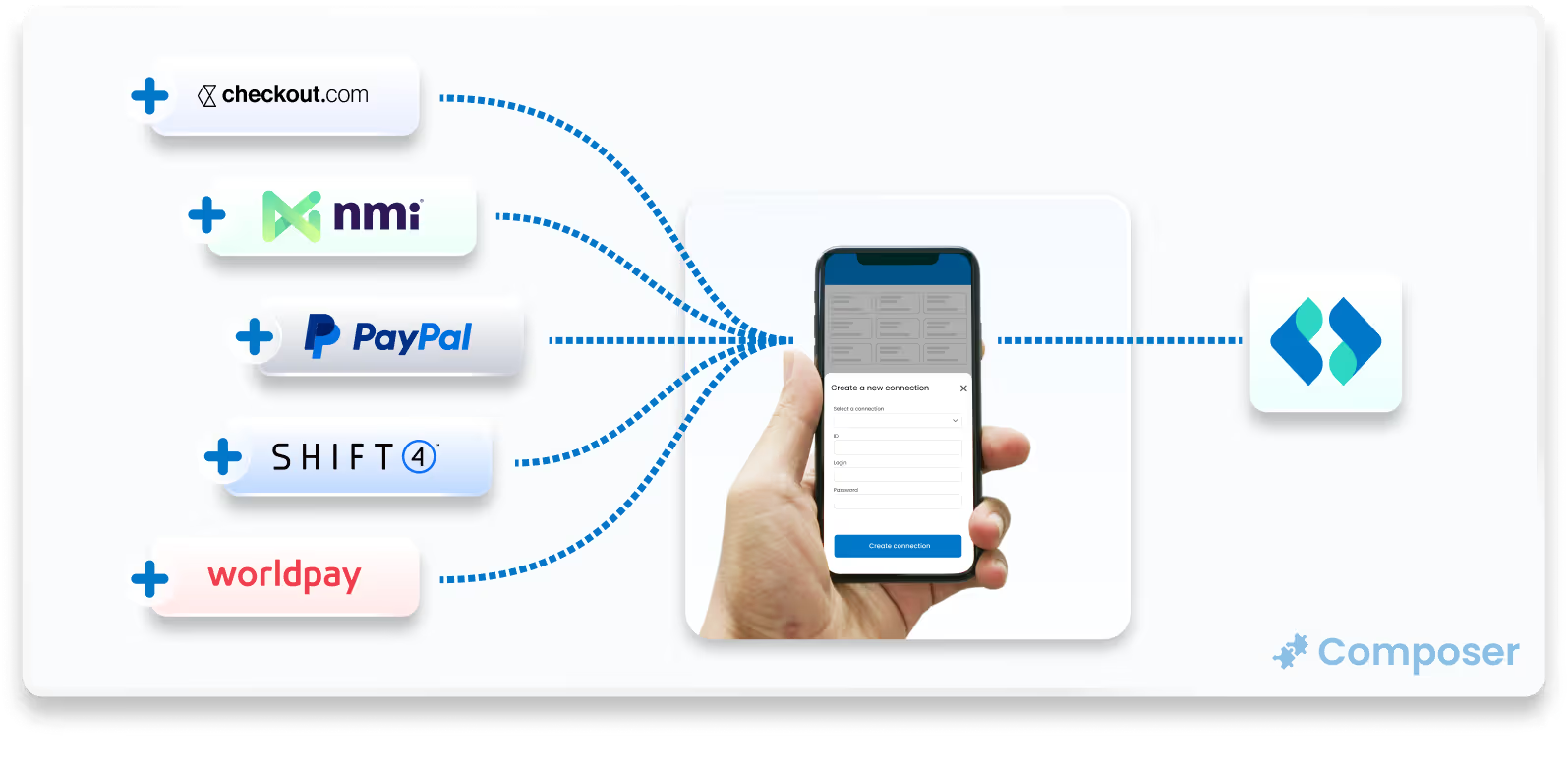
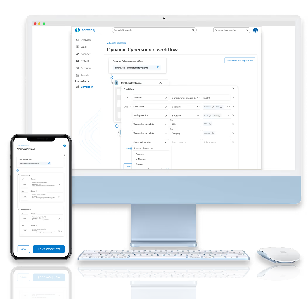
Composer transforms a complex, code-heavy backend process into a simple, visual experience for business teams. By focusing on accessibility and clarity, the platform removes technical barriers through two key features:
• No-Code Visual Workflow editor
• AI-Powered Reporting, using plain-language AI to turn data into clear insights.
This design shift moves the user experience from writing code to managing strategy, payment orchestration easier and faster to implement.

How might we...Free up developers from repetitive, low value coding tasks by giving business users the tools to build their own payment workflows.
Design Sprints are a structured five-day process used to rapidly solve complex problems and test new ideas through design, prototyping, and user testing. By condensing months of work into a single week, teams can quickly validate a product's direction without the expense of a full launch.
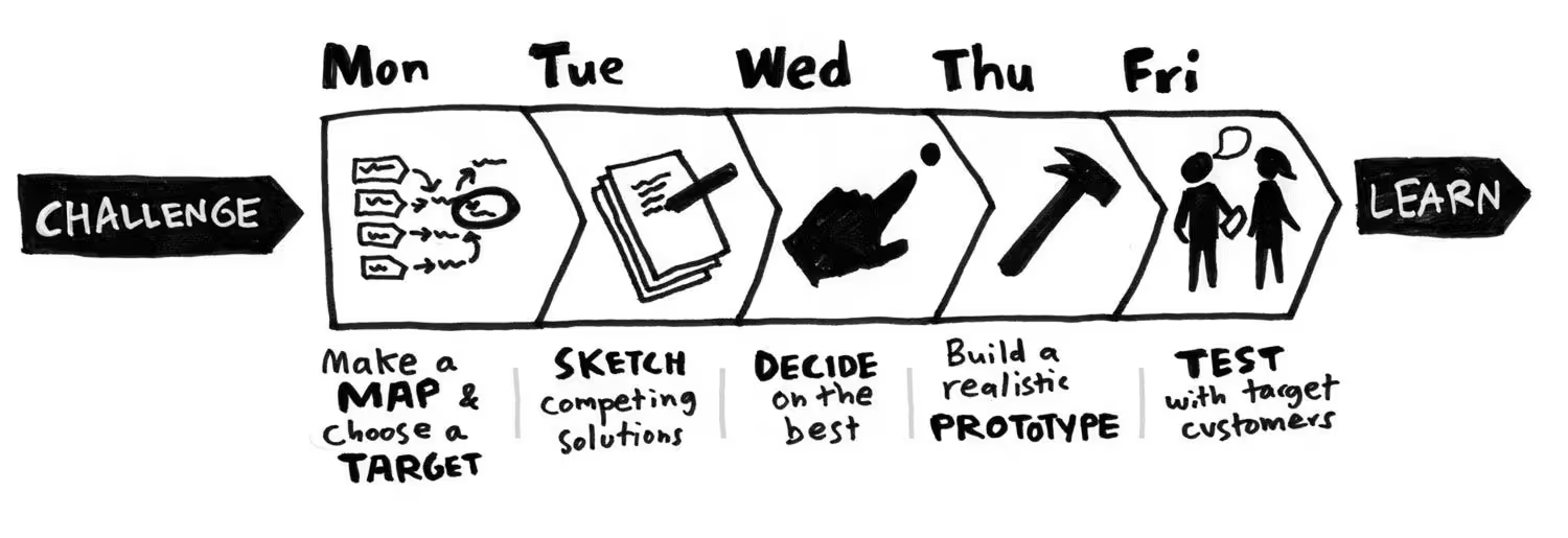
During the Design Sprint, we were dedicated to building a shared knowledge and defining a clear focus for the week. The team began by setting a long-term goal and identifying "Sprint Questions" to anticipate obstacles, followed by creating a visual map of the customer journey to pinpoint where the user experience currently breaks down.

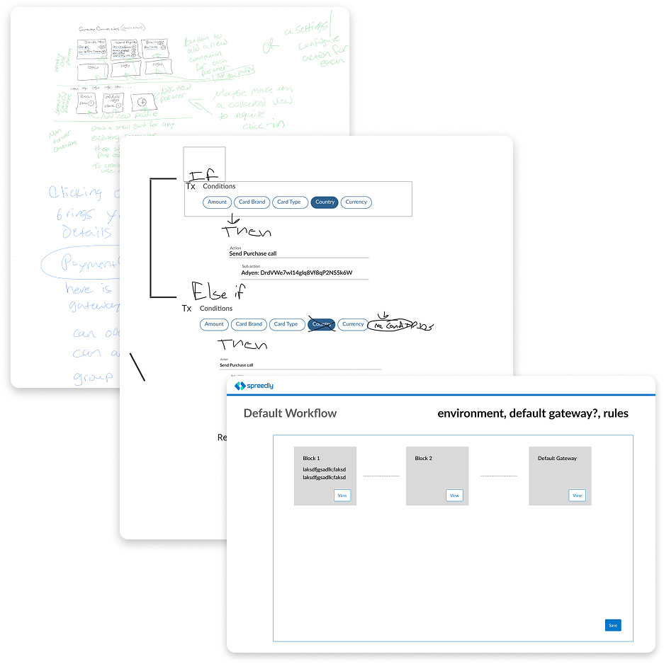
Then next key take-away in our design sprint was when each participant drew their own hand-sketched wireframes to begin visually identifying any additional problems with our current direction.
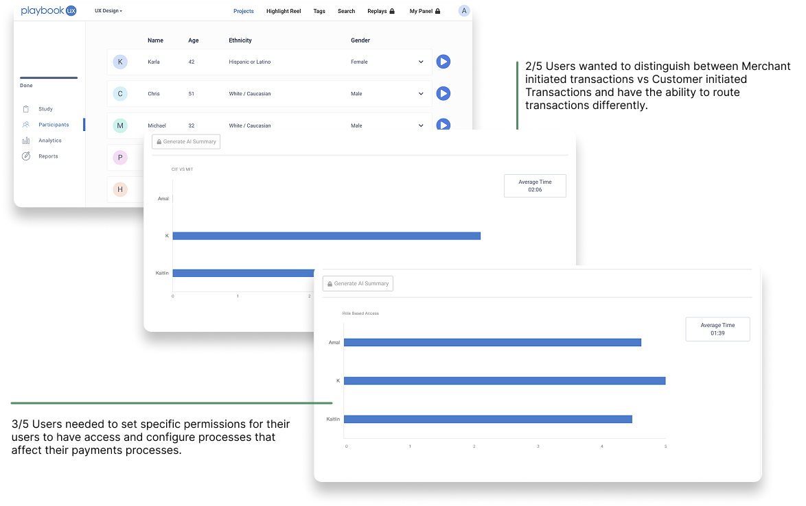
With the complex nature of Spreedly’s payments processes, we needed to make sure we were solving the right problems. I created two different user segments based on our current users.
After conducting both moderated and unmoderated user interviews, I analyzed the data and I was able to categorize the insights into these 3 categories. These were balanced between current goals and added to the criteria for 2 of the user’s requests based on scope, tech feasibility, and effort.
This concluded our Design Sprint.
Remaining Questions:
• Will we decrease implementation time?
• How will we make sure the workflows are secure and not easily changed
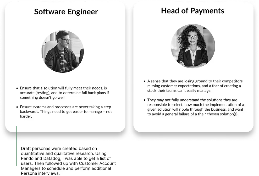
I wanted to form a deeper understanding of our users' goals, needs, experiences, and behaviors.
I identified 2 types of users with unique needs based on our workshops with our client. Each persona also raised a unique set of questions we aimed to answer during the redesign. We used these personas whenever we wanted to step out of our current frame of mind to realign on our initial assumptions and ideas.
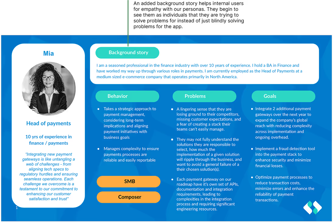
After reviewing the personas with stakeholders, I identified and defined the primary persona to focus our design efforts.
I documented additional details including:
• behaviors
• pain points
• motivations
• main goals in their current role
This richer context helped the team better understand the user’s perspective, prioritize features, and align design decisions with real-world needs and challenges.
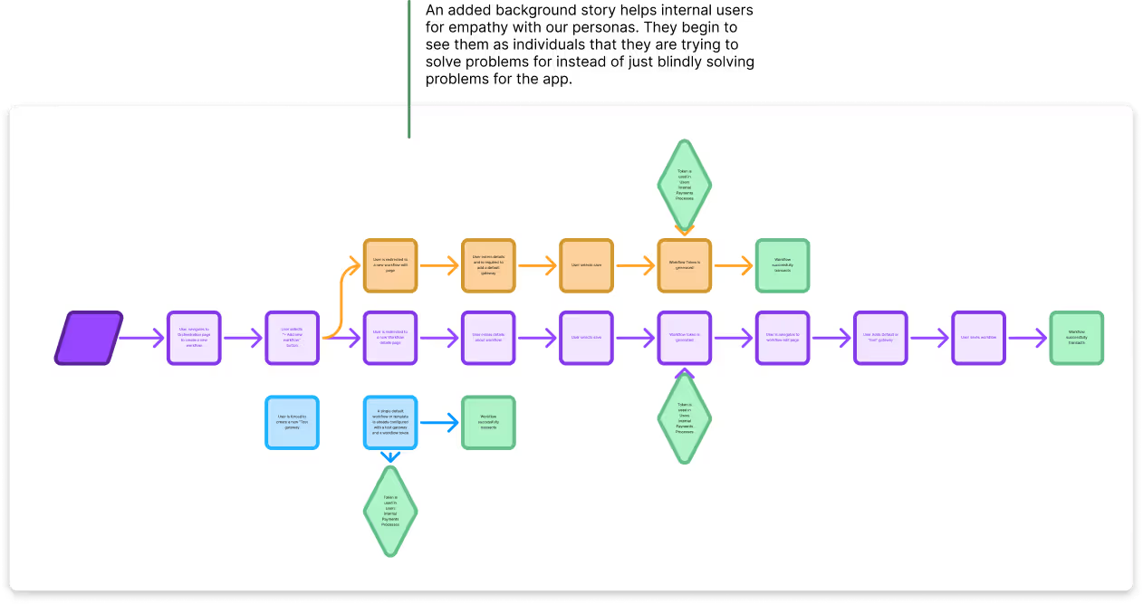
With our user personas in mind, I sketched out a current-state user journey to pin point opportunities for improvement. After drafting these flows, I looked through the current design & identified potential pain points for eachuser. Together, our stakeholder team vetted the flow and confirmed the validity of our map.
Challenges found:
• Users need to add a Merchant key to ensure payments are not declined on specific payment service providers. This was not enforced in the past due to it not being a required field.
• Users cannot designate between Authorize and Purchase transaction calls with our current tech.
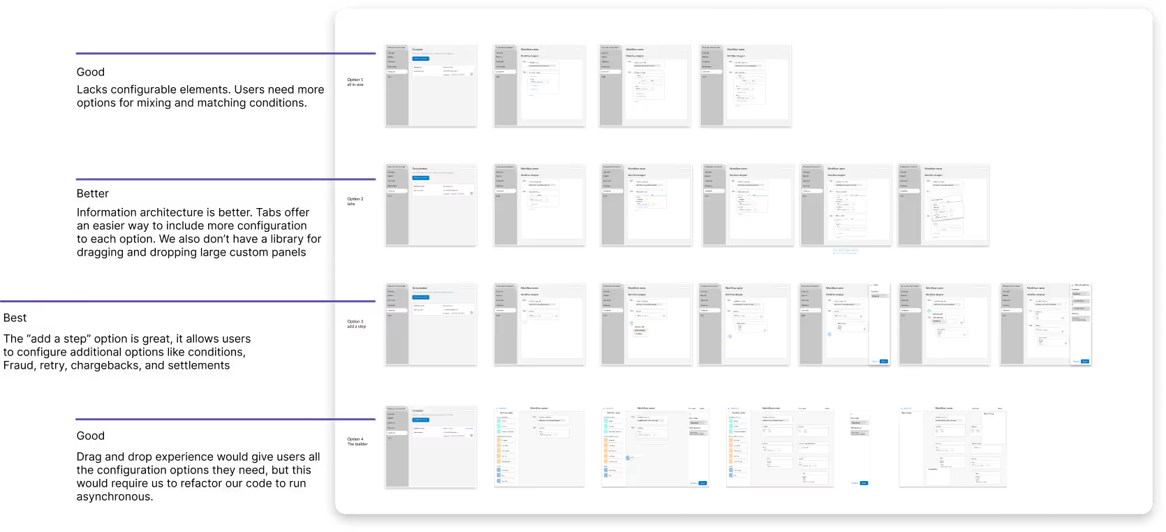
The Goal...Explore ways to reduce engineering bottlenecks by designing a no-code tool that lets business users build and manage their own payment workflows.
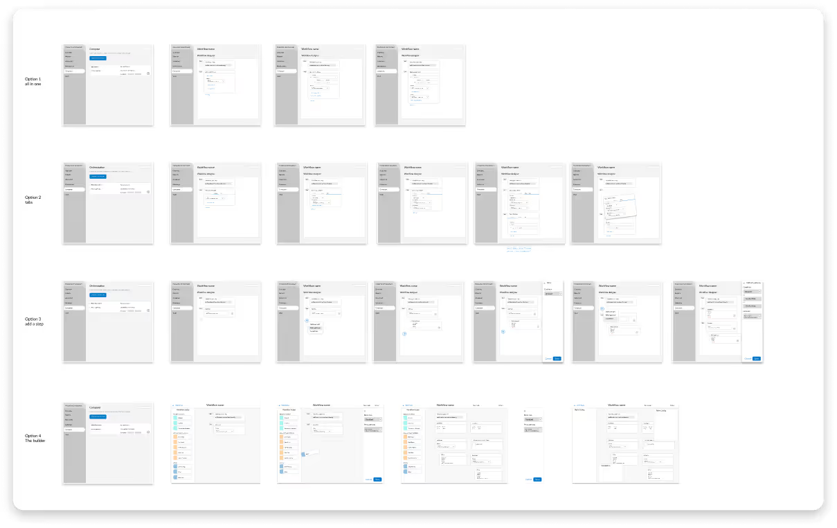
Using Figma, I translated concepts into low-fidelity wireframes. I added 4 different options to included different levels of functional and customizable frameworks.
Problems these components addressed.
1. Ease of use - Users are able to easily add, remove, and configure payment processes
2. Users can distinguish between workflows using unique identifiers
3. Varying levels of “Drag and Drop” to understand how customizable the workflows need to be

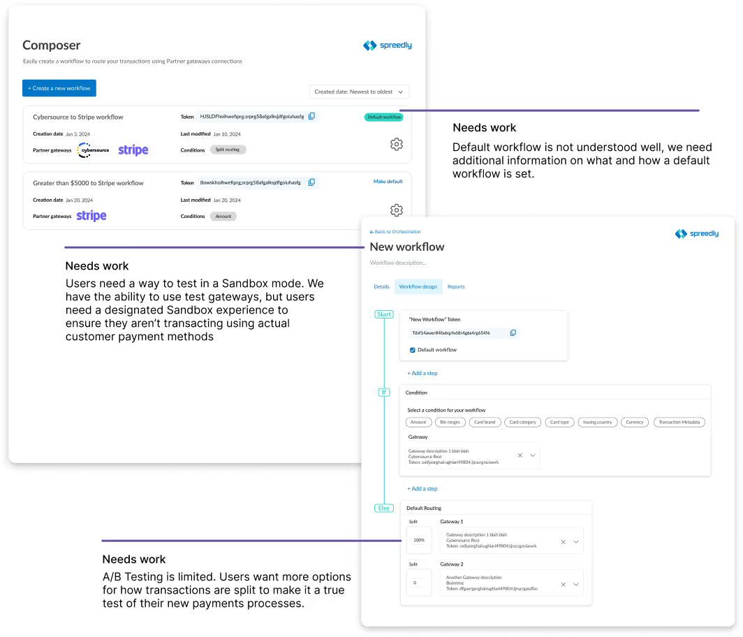
Led an open beta program combining internal QA, Customer Success, Implementation, Technical Account Managers, as well as external users to test early features, uncover bugs, validate workflows, and ensure stability before GA Launch. Managed feedback pipelines, tracked technical issues, and iterated on designs to deliver a reliable, user-ready product.
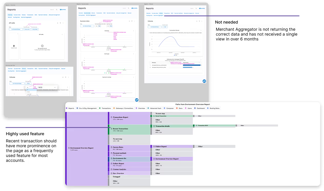
As we were getting closer to general release for the Composer product, we needed to design our reports page. At the same time, we decided to bring the reporting tools in-house, so a complete redesign of the Reporting area was in need. I conducted a Heuristic Evaluation of the Reports page in the app to identify usability issues, areas for design improvement, and unnecessary components.
In parallel, I ran a Funnel Path data exploration to analyze user behavior and uncover which pages received the most usage, where users drop off, or where users encounter friction in the reporting workflow.
Composer 1.0 was released for General Availability while I continued to gain participants for a Design Partnership program I ran. It was our version of a Labs user group, where customers could sign up for early feature access and give us feedback and view our product roadmap.
Results:
1. An increase of DAU from 600 to 710
2. An increase of successful transactions
3. A reported decrease in implementation from 75 days to 40 days
What I learned:
Designing a flexible drag-and-drop UI in Figma is straightforward, but it met resistance from engineering. This could have caused significant issues down the line. By holding regular meetings with stakeholders and front-end engineers early in the design process, we were able to weigh level of effort against user interaction. This led to productive discussions about balancing project scope with delivering a better user experience.
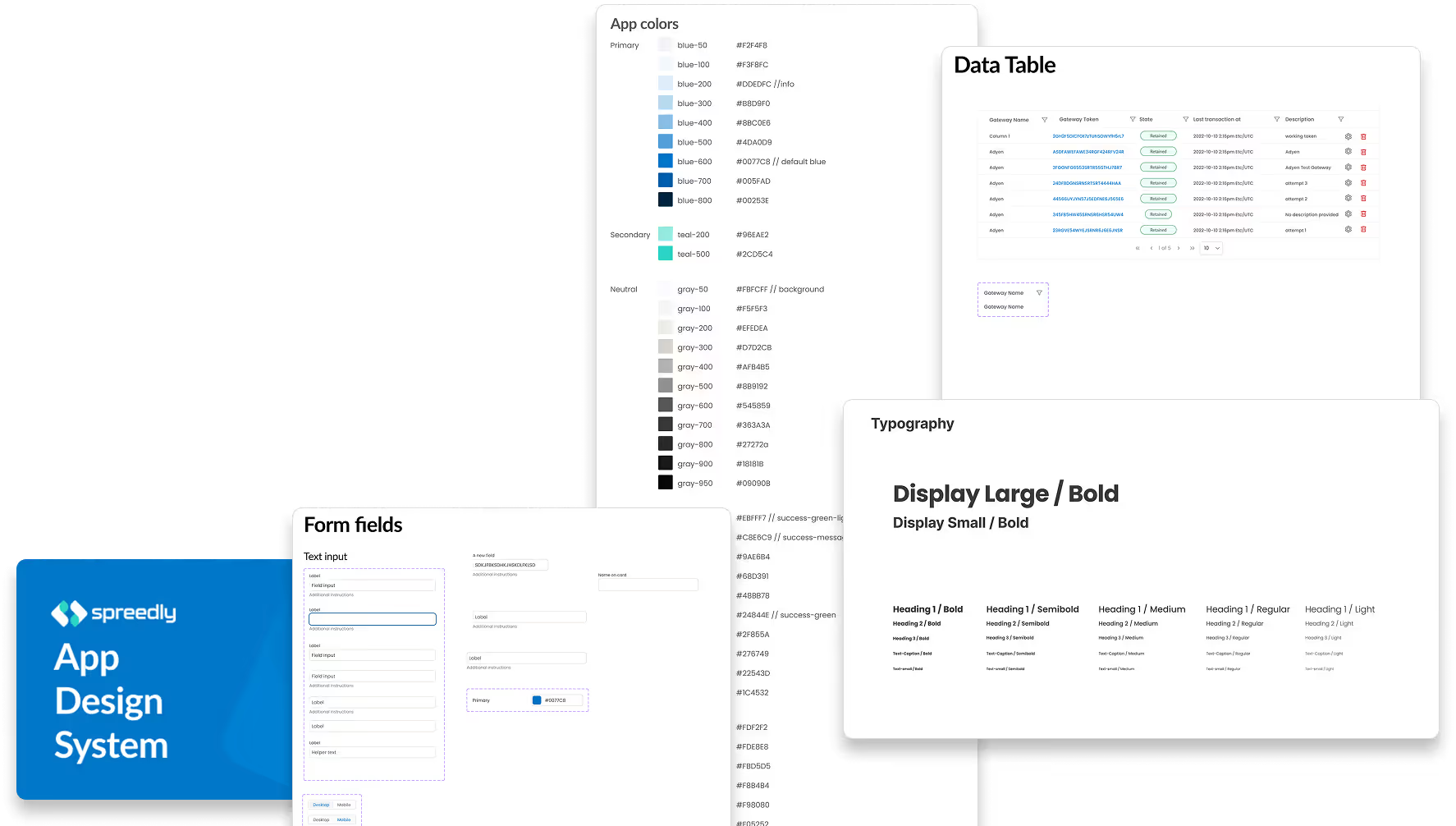
Design System Impact:
1. A shared component library ensured UI consistency across screens, letting designers focus on solving user problems instead of rebuilding elements.
2. Pre-built, reusable components reduced implementation time and minimized errors, streamlining handoffs between design and development.
3. Aligning design and engineering around a common toolkit increased productivity, accelerated iterations, and enabled higher-quality user experiences
After the product launched, we continued iterating through regular collaboration with stakeholders. We reviewed quantitative metrics and collected qualitative feedback from users to uncover pain points and opportunities. Each iteration allowed us to refine features, improve usability, and ensure the product evolved to better meet real user needs.
